What The Zorn?

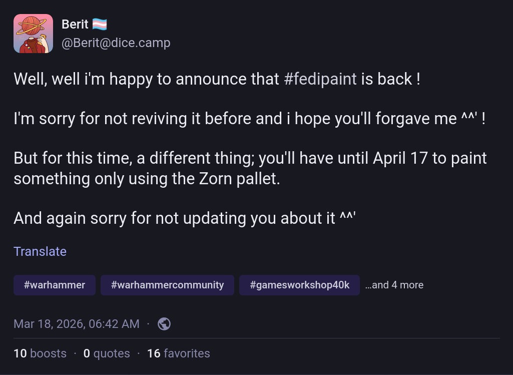
The latest #fedipaint challenge from Berit peaked my interest.
I’d never heard of the Zorn Palette before, and I was intrigued. A little bit of light reading on Wikipedia and a few searches on Kagi later and I knew that the Zorn palette is a simple palette consisting of four colours (black, white, cadmium red and yellow ochre) that is named for Anders Zorn (1860-1920)1, a Swedish portrait artist who made very effective use of it in his works (though it is unclear if he was truly the first to use this combination)2.

The palette is well suited to portrait painting, the four colours provide a limited colour gamut (no vibrant greens or blues) that is particularly good for skin tones as long as you know how to mix it properly3.

There’s an excellent tutorial on mixing using the Zorn palette by Peter Keegan4 that I found quite helpful for getting started (its part of the series, but the latter parts of the series are much more focused on oil paints, so less applicable for mini painting).
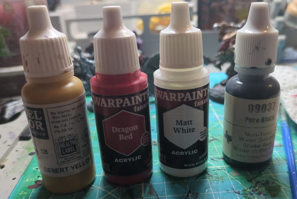
After rummaging around in my paints collection, I wound up with the following paints to serve as my “Zorn Palette”. Desert Yellow (Vallejo Model Color) served as my Yellow Ochre and Dragon Red (Army Painter Warpaints Fanatic) filled in for Cadmium Red. I then found a stark white and black to complete the Zorn tetrad.

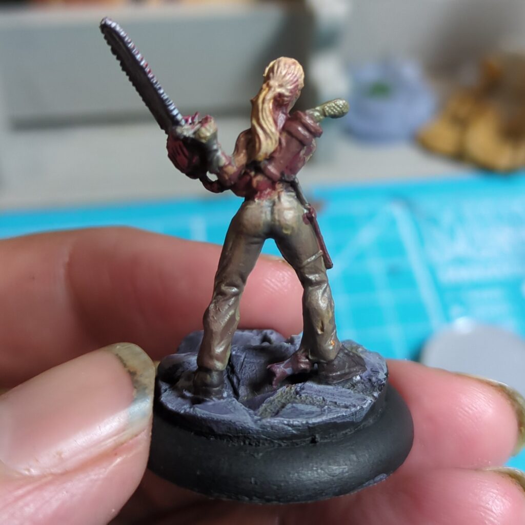
Zombie Slayer
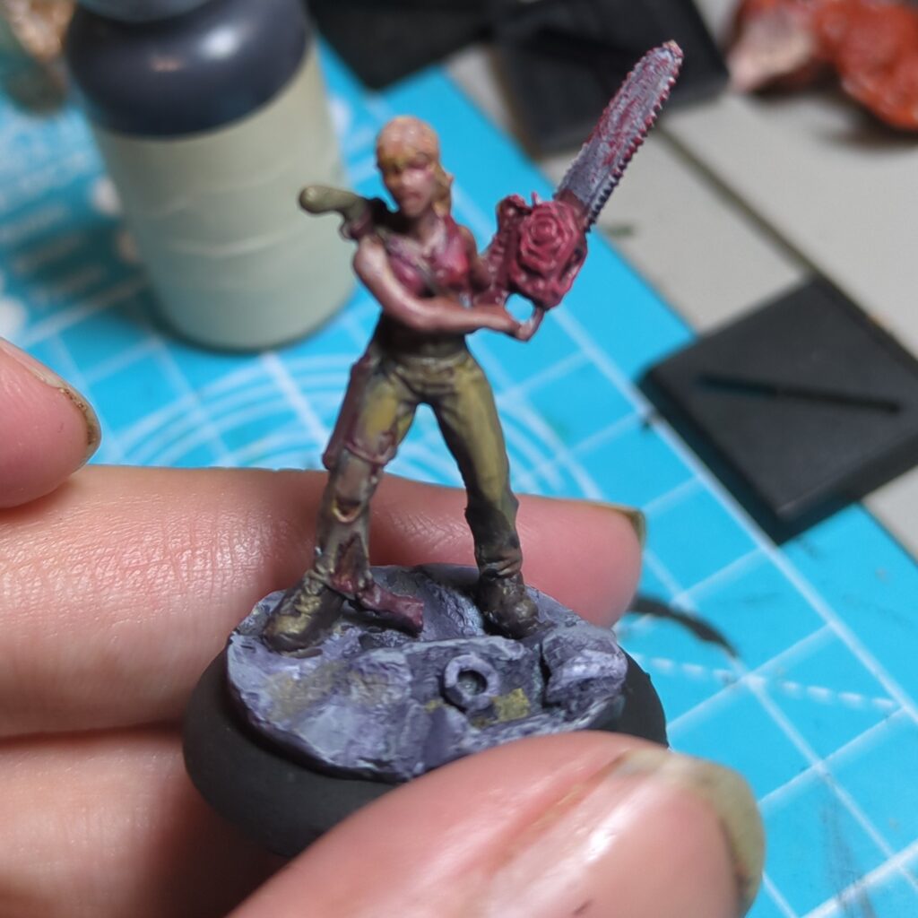
This one was another mini from an old kickstarter (probably Deadlands: Hell on Earth, but my memory is a bit fuzzy here). She was a good first start. The red top and chainsaw was easy enough, but it took a bit of experimentation to try to get an acceptable leather brown.

The skin tones came out ok but I found that my paint became quite runny after too much mixing on the wet pallette, which made it much harder to fill in the details.

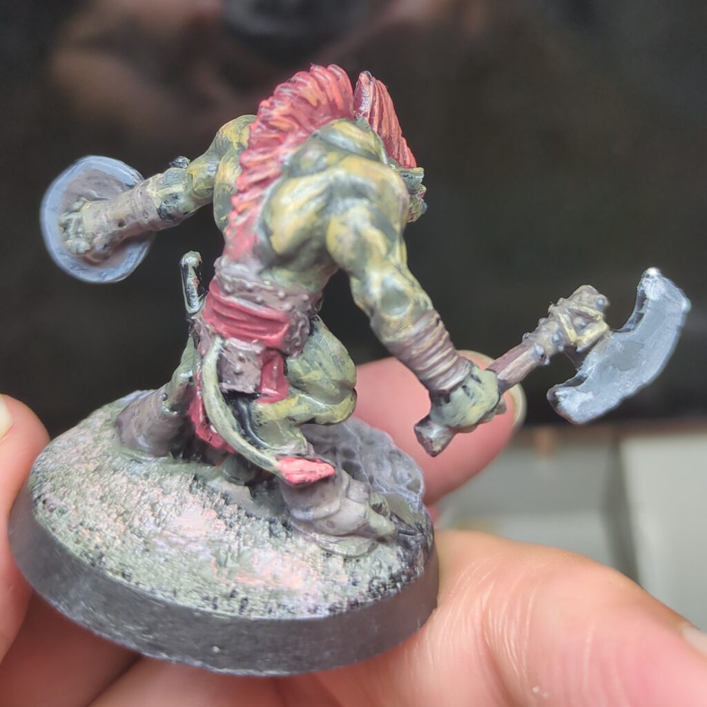
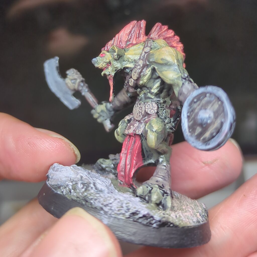
Gnoll
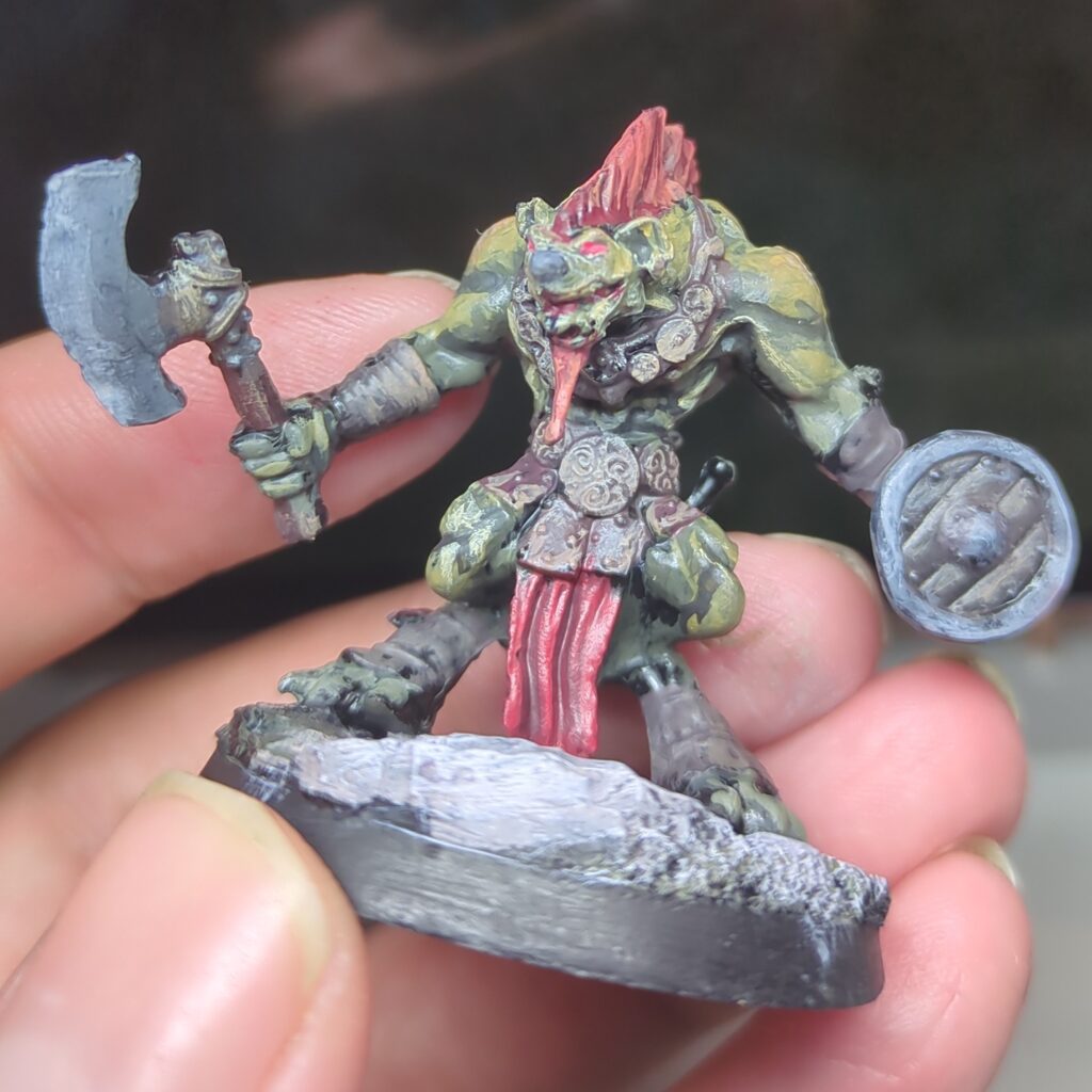
This guy technically didn’t get finished in time for Fedipaint, but he was still a fun learning exercise. It’s surprising to me how greenish the yellow looks once you mix in some black and it works well for giving his skin a greenish hue. Mixing a little yellow in for the highlights gives his mohawk a satisfying red hue.

Conclusions & Thoughts

This was a fun experiment, and definitely taught me a few things about mixing paints. While I don’t think either mini would qualify as my best work, they still turned out ok.

Mixing the colours I needed on the wet palette was challenging. I frequently found that when mixing in multiple steps (typically to create a few tones to work with) the colours tended to absorb too much water from the palette and became difficult to work with. I also often tended to end up with not enough of the colours I needed. I’m not sure precisely where I’m going wrong with my technique here, but I suspect there’s something I could be doing better.

  1. Anders Zorn. (2022, March 30). Wikipedia. https://en.wikipedia.org/wiki/Anders_Zorn ↩︎
  2. The Zorn Palette – What It Is And How You Can Use It. (2018, May 14). Draw Paint Academy. https://drawpaintacademy.com/zorn-palette/
    ↩︎
  3. Takahashi, L. (2021, February 2). Colour Mixing: Exploring the Zorn Palette. Jackson’s Art Blog. https://www.jacksonsart.com/blog/2021/02/02/colour-mixing-exploring-the-zorn-palette/
    ↩︎
  4. Peter Keegan Artist. (2022, June 13). Zorn Palette Course: 1 – Introduction to the Palette. YouTube. https://www.youtube.com/watch?v=ai_cGQxoYP8 ↩︎
A Screenshot, Some Colours and a Scheme

Quite a while ago, Miniac posted a video where he used a photo as the basis for a colour scheme. Others have also visited the same idea, but it’s an interesting concept and it struck me as a fun way to find interesting new colour schemes to try.

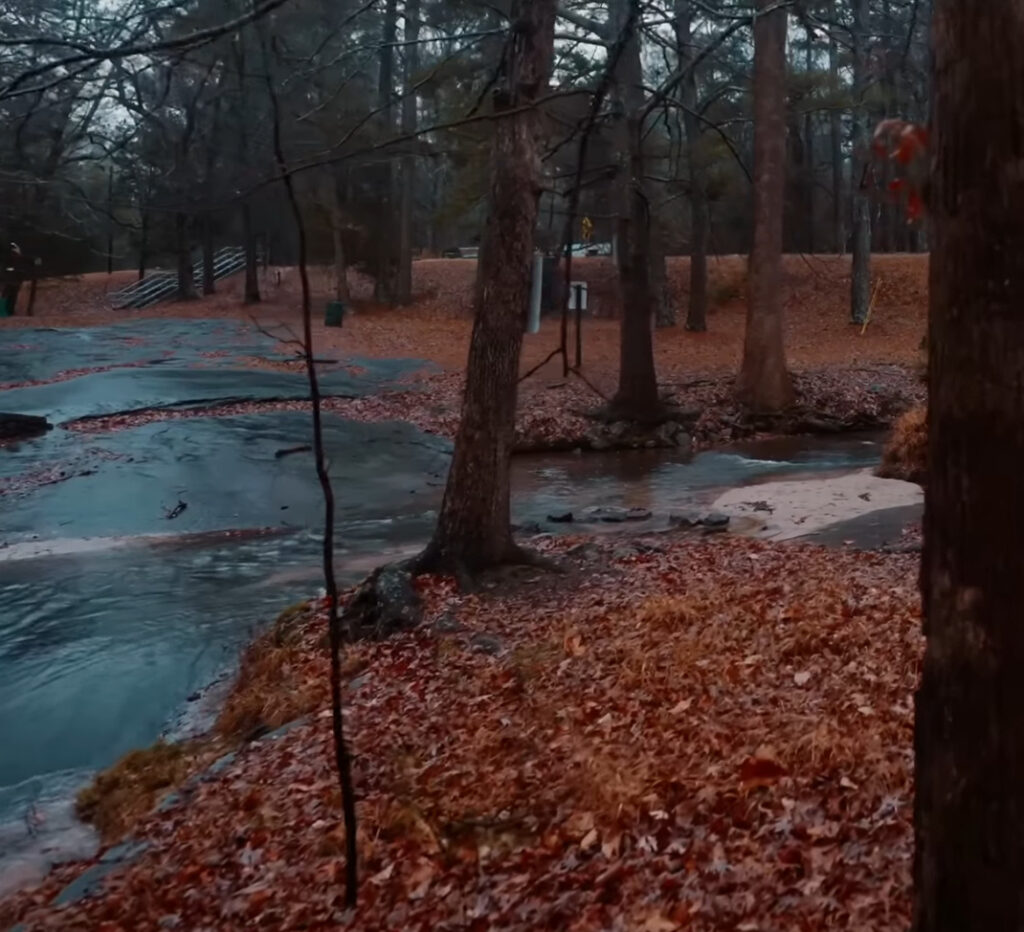
Recently, I had a background ambience video walking through a forest in a northern-hemisphere autumn, and something about the colours was very striking. The orange of the autumn leaves contrasted beautifully with the almost iridescent blue of the rocks, stone and river. The brown of the trees also looked nice, and gave me a good third colour to round out my scheme.

A wonderfully vibrant forest photo, just waiting to become a paint scheme

When it comes to picking paints, I originally expected the orange would start with a brown. But when I examined the photo more closely, I could see that the red tones are surprisingly strong amidst those leaves, so I chose to start with a dull red and shade up through orange.

For the blues I started quite dark, using a very dark blue-black as my base, and shading up to Deep Ocean (a dark teal) . This ultimately didn’t have enough contrast though, so I wound up also using a bit of Marine Teal as well just to push the highlights a bit higher. For the browns I went with a simple range of earth browns to get the colours I was looking for. This tended to be the background colour of my schemes, filling in where it made sense but not really being the focus.

Expand for detailed paints list

Orange: RMS Clotted Red (#09134), VMC Mahogany (#70846), RMS Redstone Highlight (#09225), RMS Highlight Orange (#09243)

Blue: RMS Nightmare Black (#09280), VMC Dark Sea Blue (#70898), RMS Deep Ocean (#09076), RMS Marine Teal (#09077)

Brown: RMS Dark Shadow (#09040), RMS Muddy Brown (#09028), RMS Dark Highlights (#09042)

Abbreviations: RMS is Reaper Master Series, VMC is Vallejo Model Colour

The Lizardman

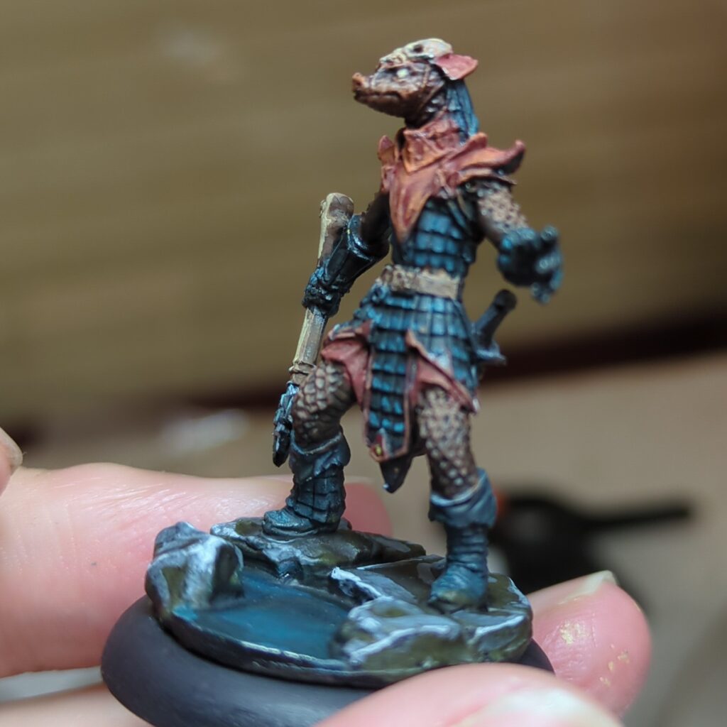
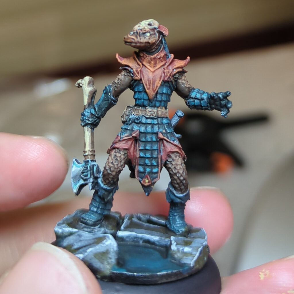
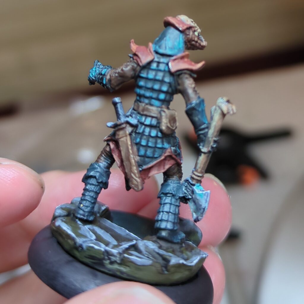
The first model I tried this colour scheme out on was a lizard man figure (Degenerate Serpentfolk from Reaper Minis). I went with the blues for his scalemail armour, with the orange used for most of the trim and details. I reserved the browns for the leggings and sleeves (as well as his flesh).

I’m pretty happy with this overall combination. It’s pleasing to the eye and yet a little bit novel. While I don’t think it’s a exact match to the photo, I don’t think I would have thought of this colour scheme if I hadn’t tried this exercise – so I consider this to be a success.

The Pirate

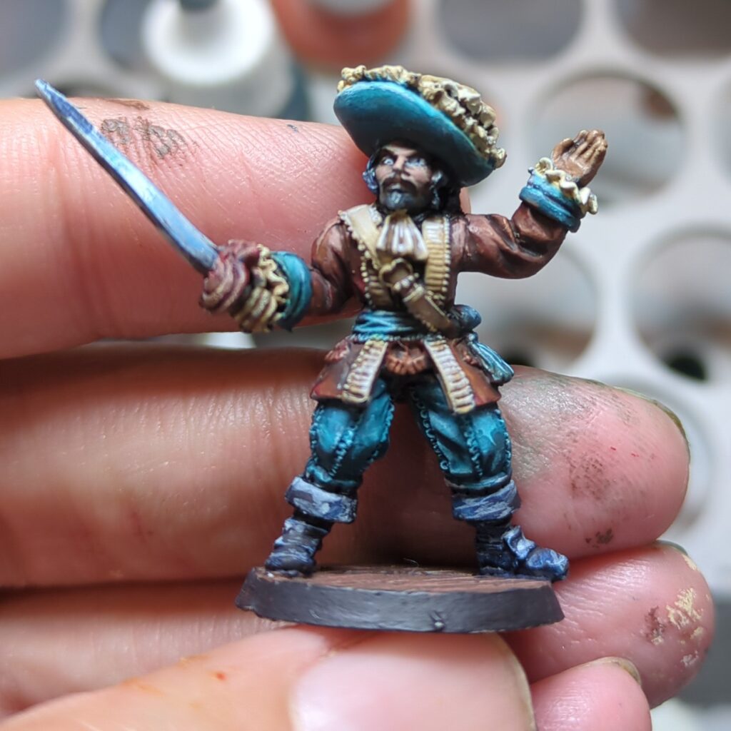
The second model I applied this too was an old Pirate mini that’s been sitting in my backlog for quite some time. From memory he was part of a set I fished out of a bargain bin long ago.

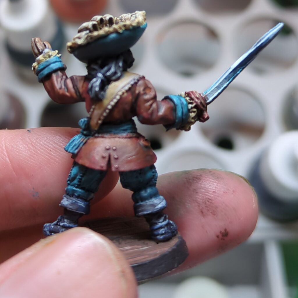
I did end up changing the colour scheme up a bit on this one, mostly because he was wearing a ruffled poets shirt that wouldn’t look right if it wasn’t white. The mahogany went well for his coat and jacket, with the teal providing a wonderful contrast for his hat, sash and pants. The darker brown didn’t end up making it into the composition.

I did put a bit more effort into pushing the contrast with this figure, which paid off and I’m very happy with the result. It definitely helps the mini pop.

The Trooper

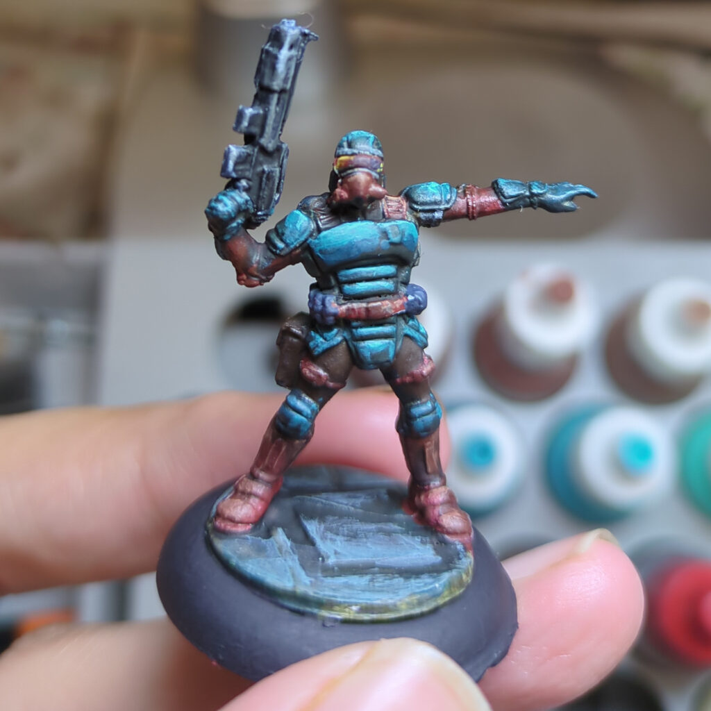
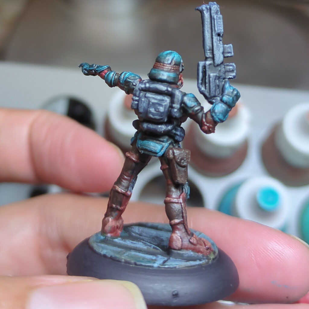
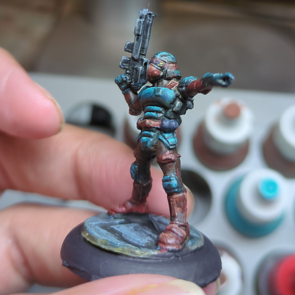
The last of the three minis was a sci-fi trooper figure from my pile of old Reaper Bones figures. I again chose to go with the more vibrant, higher contrast approach I went with for the pirate. Whilst that may not be the most realistic choice for a military uniform, it certainly produced a nice result. I do wonder if I could use this scheme for a StarGrave or Space Wierdos crew in the future.

This proved to be quite a fun experiment, and one I’ll probably repeat with other schemes in future. The teal and mahogany are both solid colour results that I’m sure to use in other schemes in the future, and I think I’ve learnt a bit of colour theory along the way.