The latest #fedipaint challenge from Berit peaked my interest.
I’d never heard of the Zorn Palette before, and I was intrigued. A little bit of light reading on Wikipedia and a few searches on Kagi later and I knew that the Zorn palette is a simple palette consisting of four colours (black, white, cadmium red and yellow ochre) that is named for Anders Zorn (1860-1920)1, a Swedish portrait artist who made very effective use of it in his works (though it is unclear if he was truly the first to use this combination)2.
The palette is well suited to portrait painting, the four colours provide a limited colour gamut (no vibrant greens or blues) that is particularly good for skin tones as long as you know how to mix it properly3.
There’s an excellent tutorial on mixing using the Zorn palette by Peter Keegan4 that I found quite helpful for getting started (its part of the series, but the latter parts of the series are much more focused on oil paints, so less applicable for mini painting).
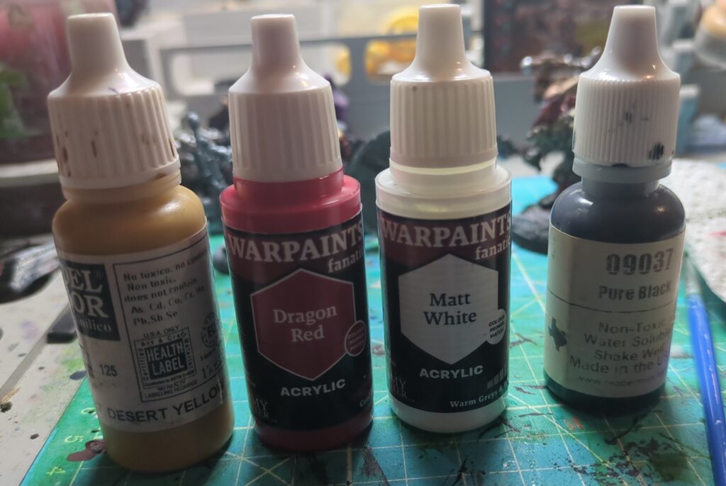
After rummaging around in my paints collection, I wound up with the following paints to serve as my “Zorn Palette”. Desert Yellow (Vallejo Model Color) served as my Yellow Ochre and Dragon Red (Army Painter Warpaints Fanatic) filled in for Cadmium Red. I then found a stark white and black to complete the Zorn tetrad.
Zombie Slayer
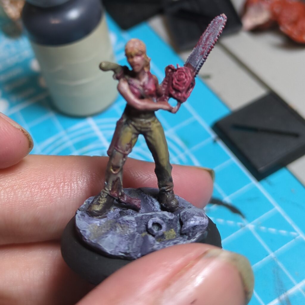
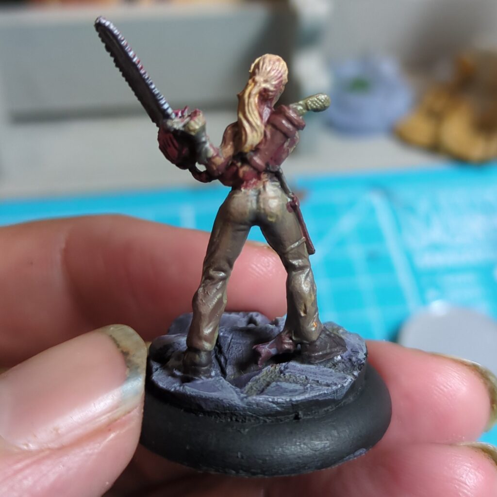
This one was another mini from an old kickstarter (probably Deadlands: Hell on Earth, but my memory is a bit fuzzy here). She was a good first start. The red top and chainsaw was easy enough, but it took a bit of experimentation to try to get an acceptable leather brown.
The skin tones came out ok but I found that my paint became quite runny after too much mixing on the wet pallette, which made it much harder to fill in the details.
Gnoll
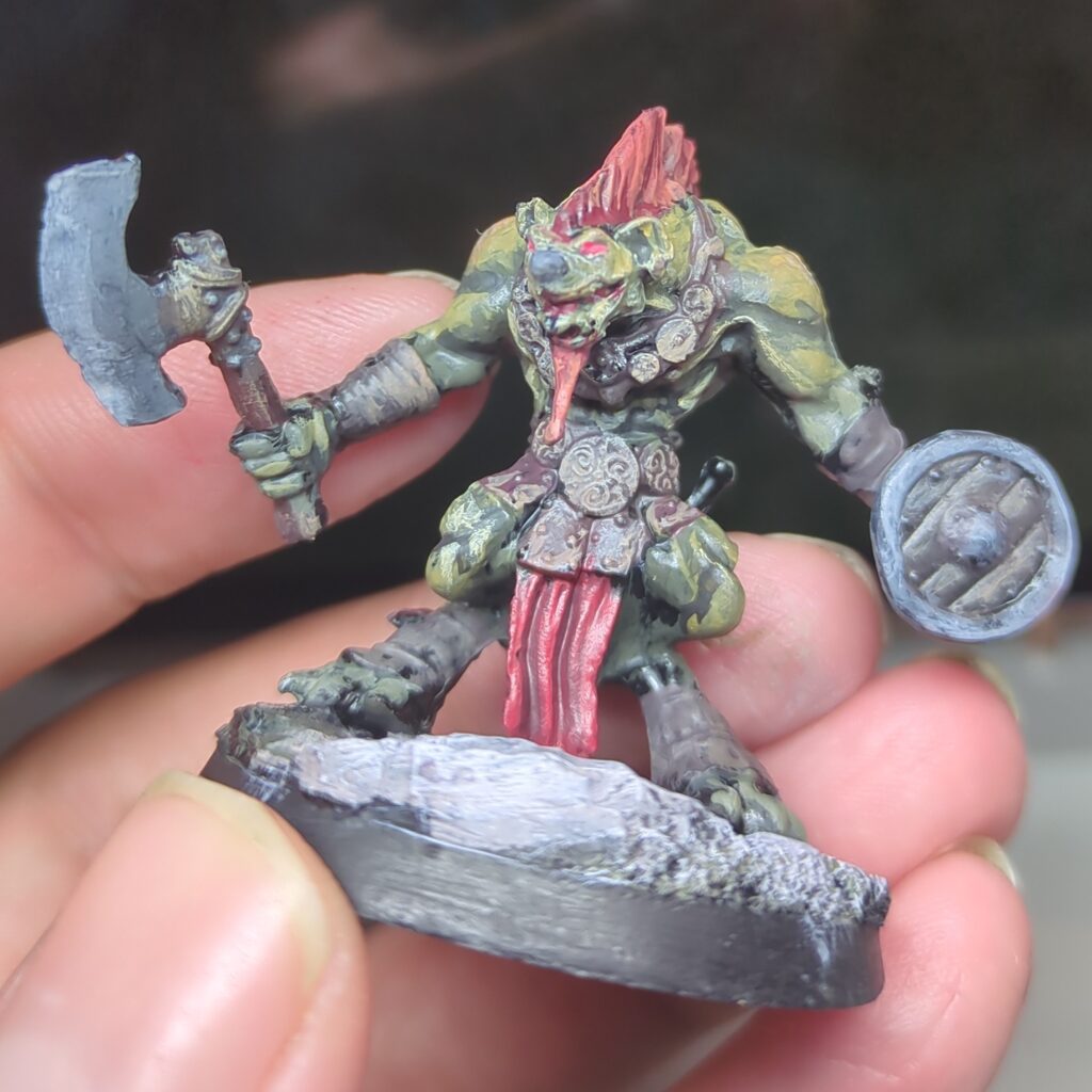
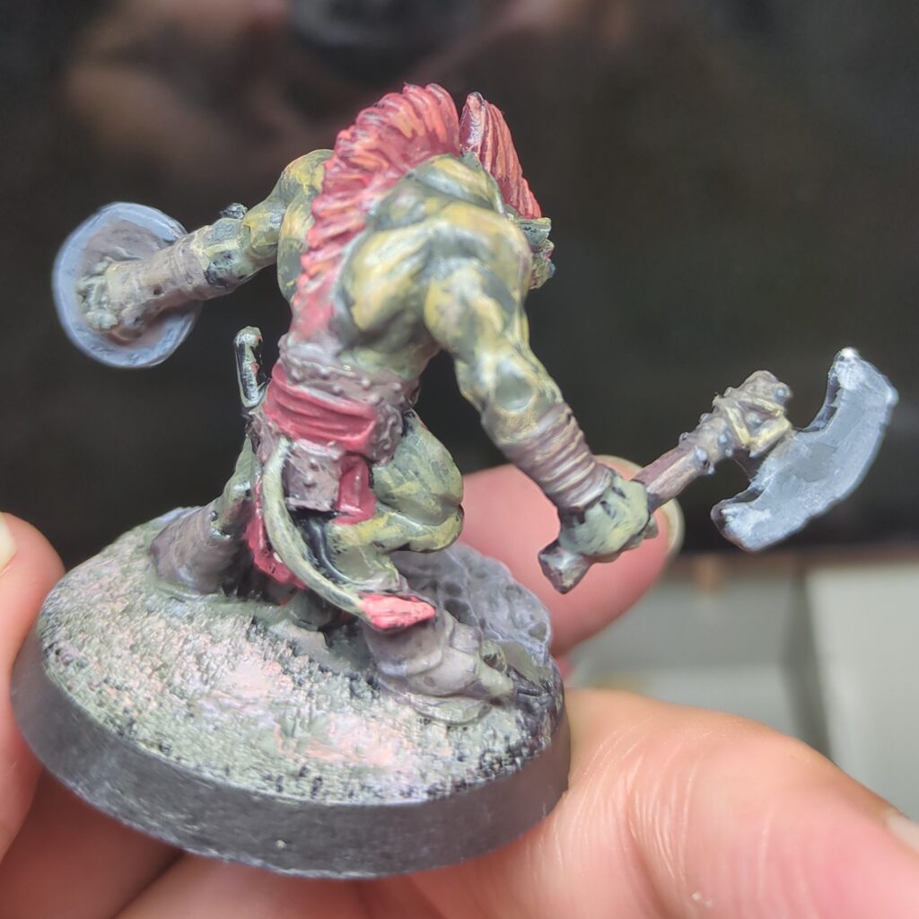
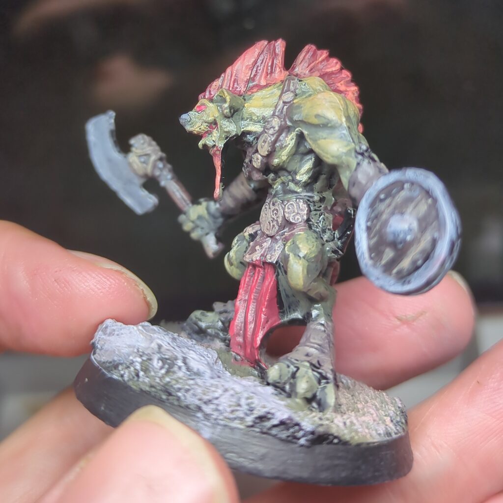
This guy technically didn’t get finished in time for Fedipaint, but he was still a fun learning exercise. It’s surprising to me how greenish the yellow looks once you mix in some black and it works well for giving his skin a greenish hue. Mixing a little yellow in for the highlights gives his mohawk a satisfying red hue.
Conclusions & Thoughts
This was a fun experiment, and definitely taught me a few things about mixing paints. While I don’t think either mini would qualify as my best work, they still turned out ok.
Mixing the colours I needed on the wet palette was challenging. I frequently found that when mixing in multiple steps (typically to create a few tones to work with) the colours tended to absorb too much water from the palette and became difficult to work with. I also often tended to end up with not enough of the colours I needed. I’m not sure precisely where I’m going wrong with my technique here, but I suspect there’s something I could be doing better.
- Anders Zorn. (2022, March 30). Wikipedia. https://en.wikipedia.org/wiki/Anders_Zorn ↩︎
- The Zorn Palette – What It Is And How You Can Use It. (2018, May 14). Draw Paint Academy. https://drawpaintacademy.com/zorn-palette/
↩︎ - Takahashi, L. (2021, February 2). Colour Mixing: Exploring the Zorn Palette. Jackson’s Art Blog. https://www.jacksonsart.com/blog/2021/02/02/colour-mixing-exploring-the-zorn-palette/
↩︎ - Peter Keegan Artist. (2022, June 13). Zorn Palette Course: 1 – Introduction to the Palette. YouTube. https://www.youtube.com/watch?v=ai_cGQxoYP8 ↩︎