Last year wasn’t a great year for hobbies. Work kept me busy enough through most of the year that when I got home I was often too tired for any hobby activities. Overall, four minis were finished for the whole year – the last of the three miniatures as part of an experiment with colour schemes1, and three more Hell Dorado figures slowly completed over a few nights.2
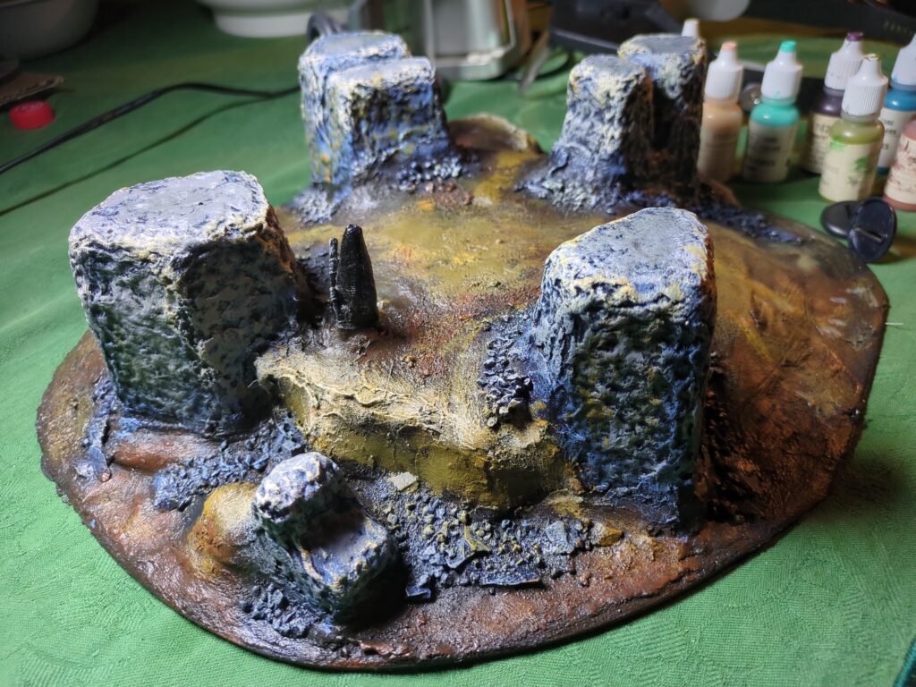
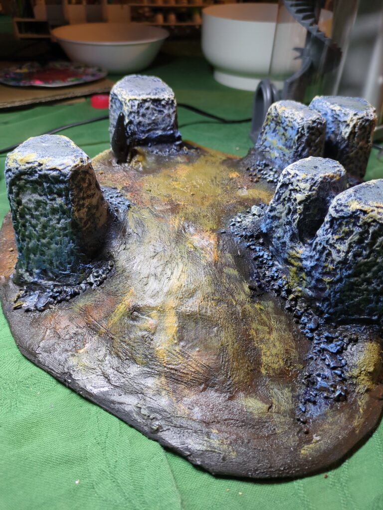
I’ve also got a terrain project that’s close to completion, but hasn’t made it yet – it has been mostly painted but play-testing has found that the slopes of the hills on it are still a bit too steep despite my best efforts. I have a plan to fix that, but it does mean I’ve got a bit to redo. There’s also a small cairn detail that remains unpainted, but that can wait until the piece is fixed and the rocks also repainted.
This slope proved a little too steep for most minis.
I also managed to conclude a long running Numenera Campaign and the beginning of a new Invisible Sun campaign. That campaign is still very early, but so far is looking good3.
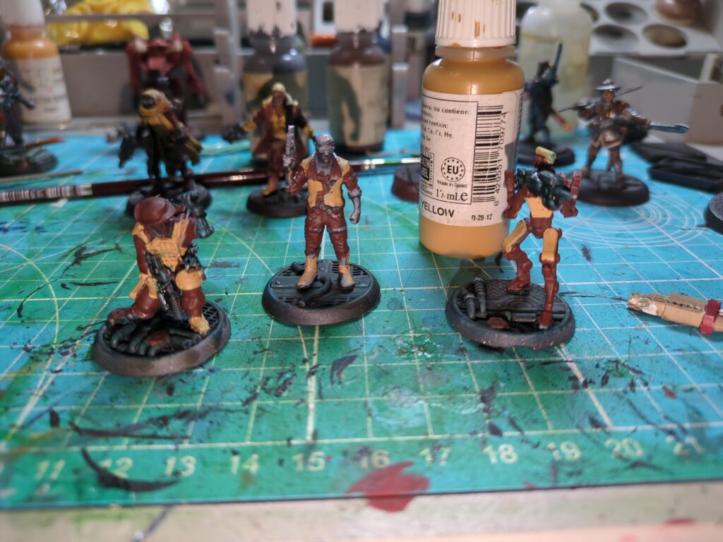
But this year is already off to a better start. I had a few friends over for a hobby day on New Years Day, and it lead to much fun, camaraderie and a productive afternoon of hobby activities. Two more Hell Dorado troops have been finished, as well as one StarGrave crewman (with three more started and in the pipeline).
Basecoats down, still working on the rest.
Overall, a pretty good start to 2026. Here’s hoping I can keep the momentum up as the year continues.
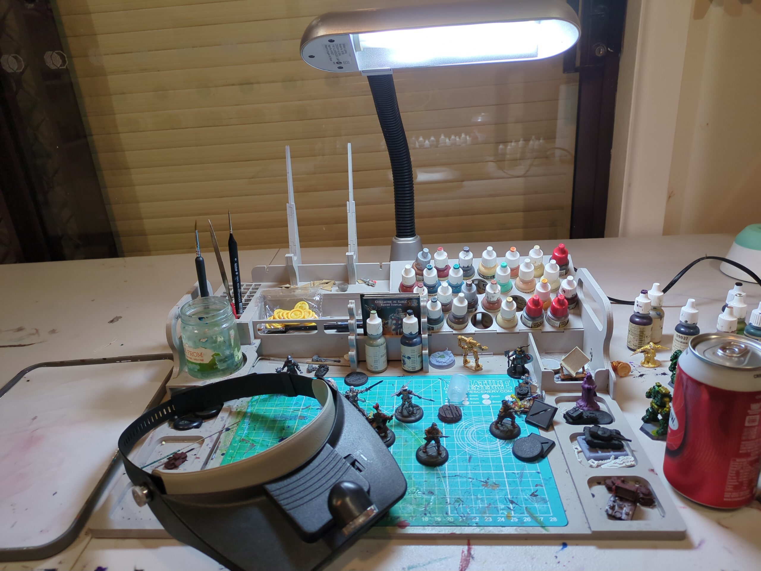
I’ve gotten to pick up my paintbrush and hobby tools a lot less this year than I would like, in part because my professional life was particularly hectic this year. Combine that with my paint desk being occupied by old computer parts for a few months whilst I was testing them and either fixing them or listing them for sale
An old X-Box that broke sometime back when my eldest was just a toddler has been returned to service (one replacement HDD and one hair-clip fished out of the disc drive and it’s all good to go again). A lot of the old parts I didn’t need got listed for sale online and I’m glad to say I found homes for most of the old parts, freeing up a bunch of space and putting a modest amount of change in my pocket – I even managed to offload some defective items to someone who wanted to have a crack at repairing them. Working through it all was a PITA, but I’m glad I did it this way rather than just dumping the lot and adding to the e-waste problem.
But of course, while this was happening I didn’t have my paint desk to use, and so having freed it up again I was recently glad to be able to get back into painting.
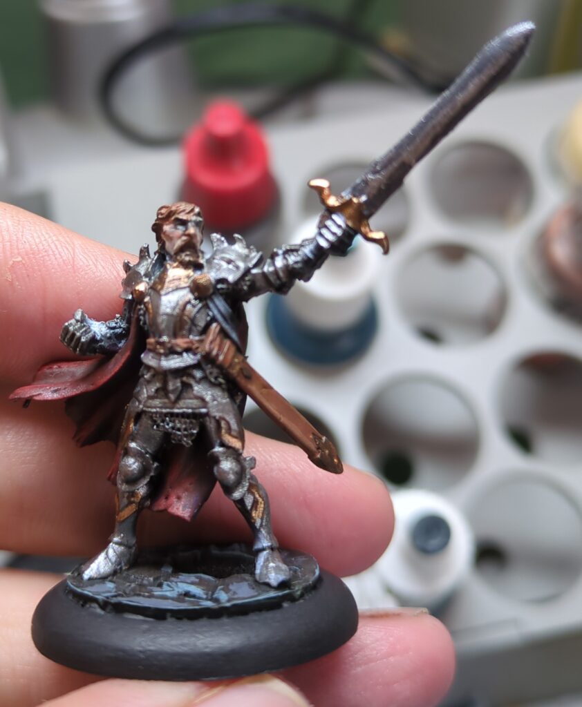
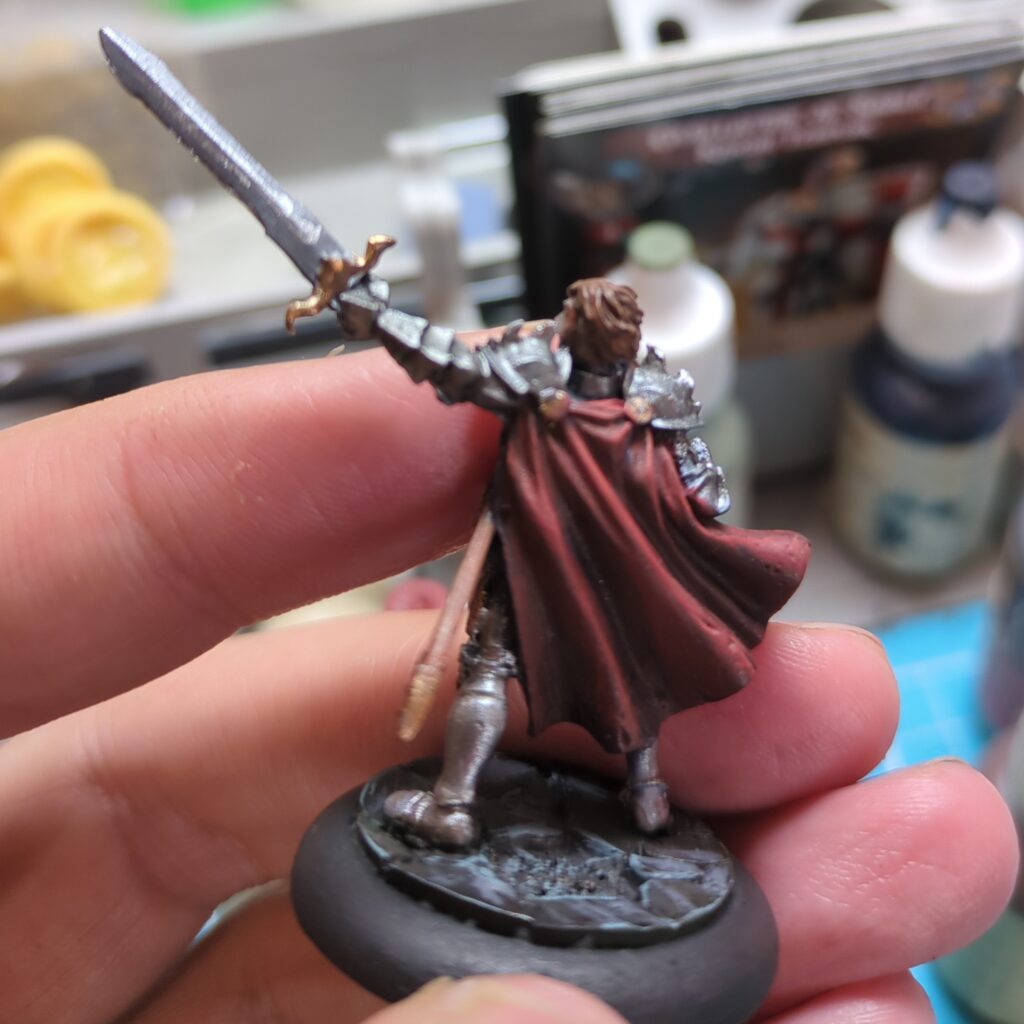
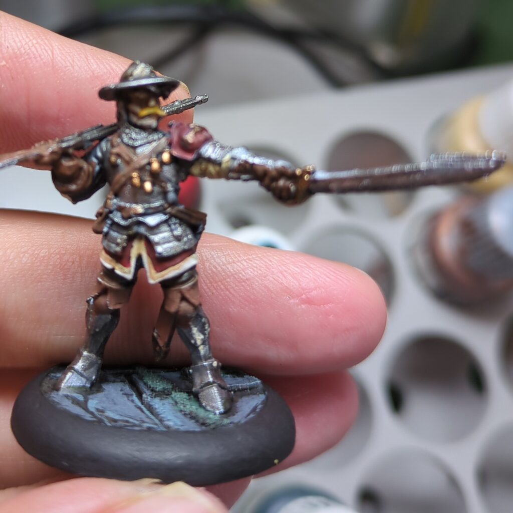
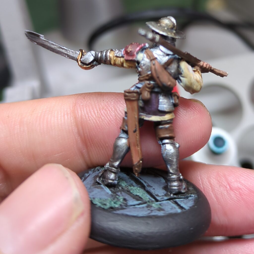
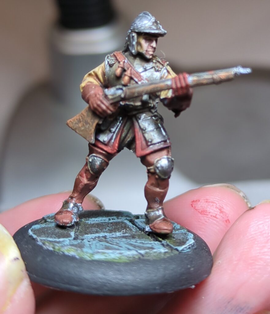
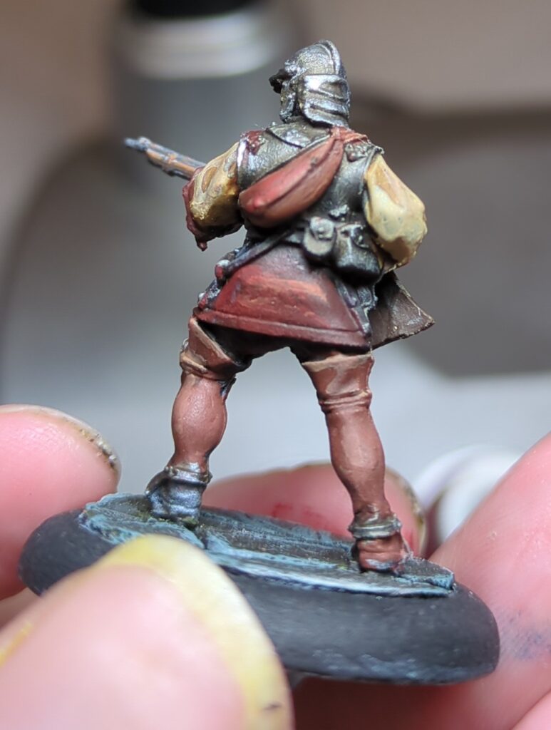
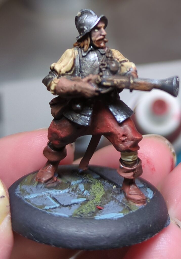
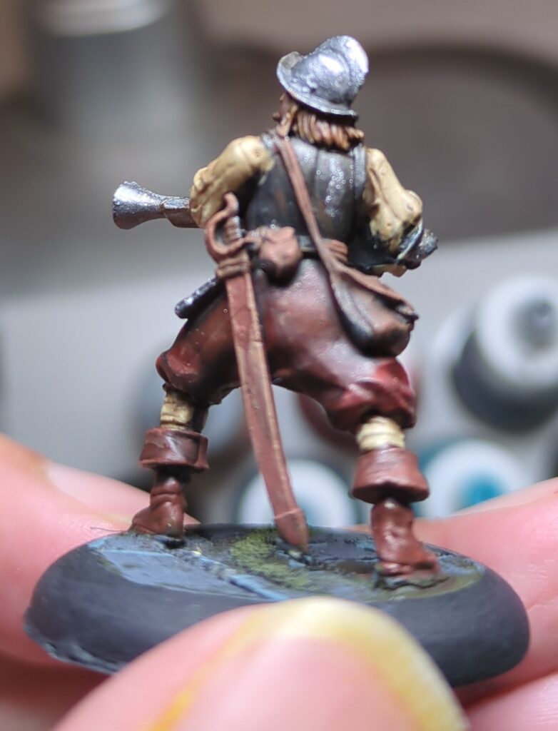
I eased back into things for the first paint session in awhile, starting by finishing up some Hell Dorado Westerners that had been languishing in a mostly completed state for most of this year. Two are now finished up, one is very close and two more are on their way but still need a bit more effort.
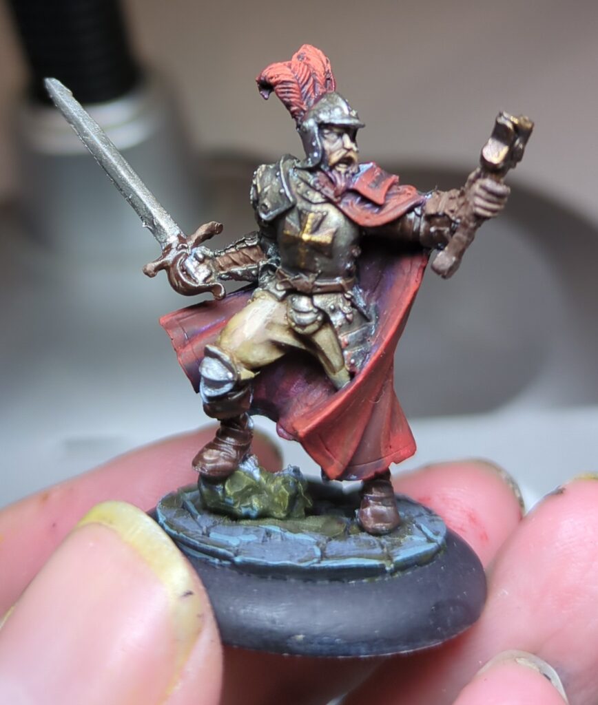
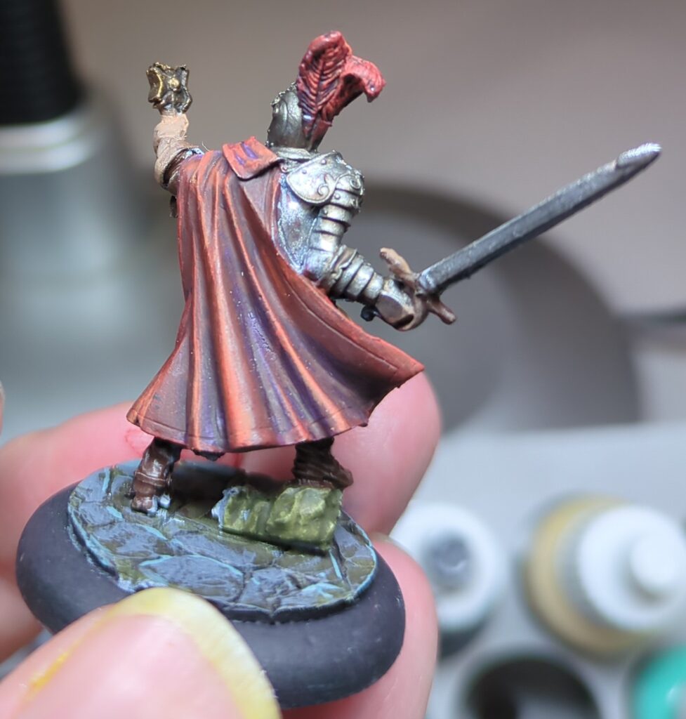
Francisco Vargas, ready for battle.Francisco Vargas has a nice capeAnother Arquebuser, ready to goAnd from the backLooking good from the front.Mostly there, but need to work on the hilt of his sword.These two still need a bit more work
Pretty happy with that, and already looking forward to the next time I get to pick up a brush.
Quite a while ago, Miniac posted a video where he used a photo as the basis for a colour scheme. Others have also visited the same idea, but it’s an interesting concept and it struck me as a fun way to find interesting new colour schemes to try.
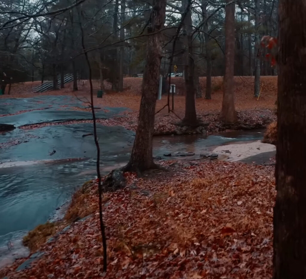
Recently, I had a background ambience video walking through a forest in a northern-hemisphere autumn, and something about the colours was very striking. The orange of the autumn leaves contrasted beautifully with the almost iridescent blue of the rocks, stone and river. The brown of the trees also looked nice, and gave me a good third colour to round out my scheme.
A wonderfully vibrant forest photo, just waiting to become a paint scheme
When it comes to picking paints, I originally expected the orange would start with a brown. But when I examined the photo more closely, I could see that the red tones are surprisingly strong amidst those leaves, so I chose to start with a dull red and shade up through orange.
For the blues I started quite dark, using a very dark blue-black as my base, and shading up to Deep Ocean (a dark teal) . This ultimately didn’t have enough contrast though, so I wound up also using a bit of Marine Teal as well just to push the highlights a bit higher. For the browns I went with a simple range of earth browns to get the colours I was looking for. This tended to be the background colour of my schemes, filling in where it made sense but not really being the focus.
Blue: RMS Nightmare Black (#09280), VMC Dark Sea Blue (#70898), RMS Deep Ocean (#09076), RMS Marine Teal (#09077)
Brown: RMS Dark Shadow (#09040), RMS Muddy Brown (#09028), RMS Dark Highlights (#09042)
Abbreviations: RMS is Reaper Master Series, VMC is Vallejo Model Colour
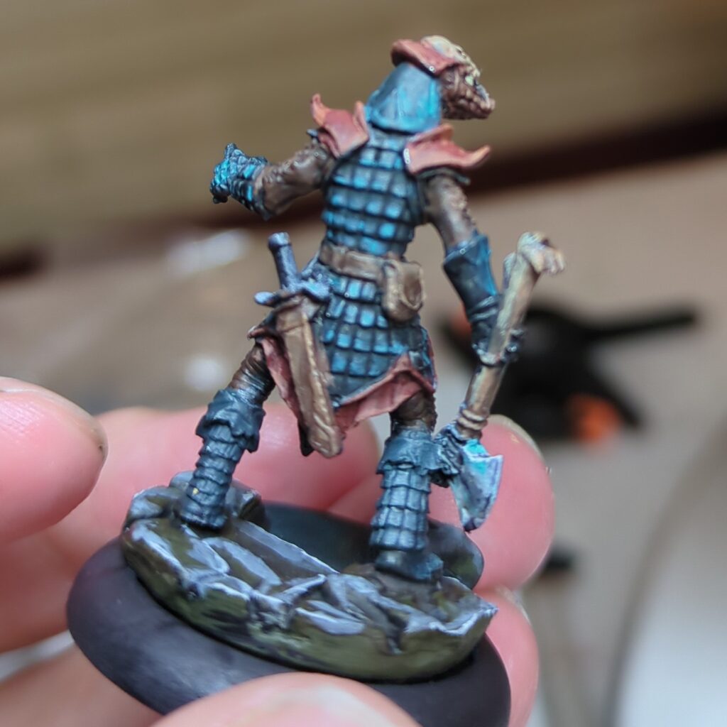
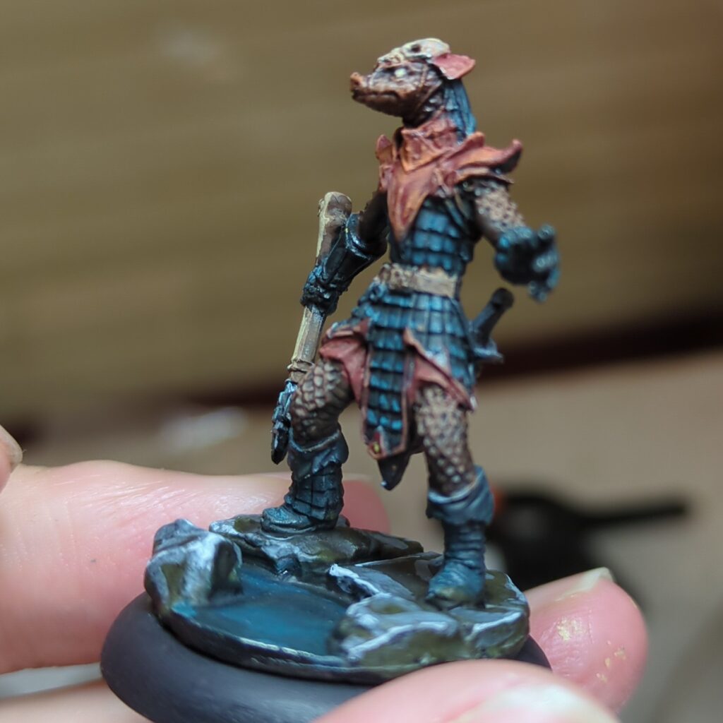
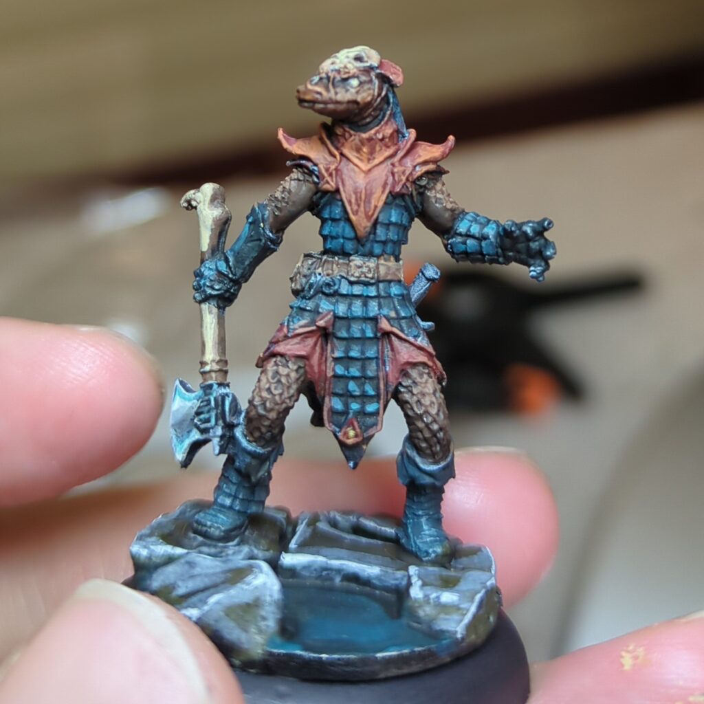
The Lizardman
The first model I tried this colour scheme out on was a lizard man figure (Degenerate Serpentfolk from Reaper Minis). I went with the blues for his scalemail armour, with the orange used for most of the trim and details. I reserved the browns for the leggings and sleeves (as well as his flesh).
I’m pretty happy with this overall combination. It’s pleasing to the eye and yet a little bit novel. While I don’t think it’s a exact match to the photo, I don’t think I would have thought of this colour scheme if I hadn’t tried this exercise – so I consider this to be a success.
The Pirate
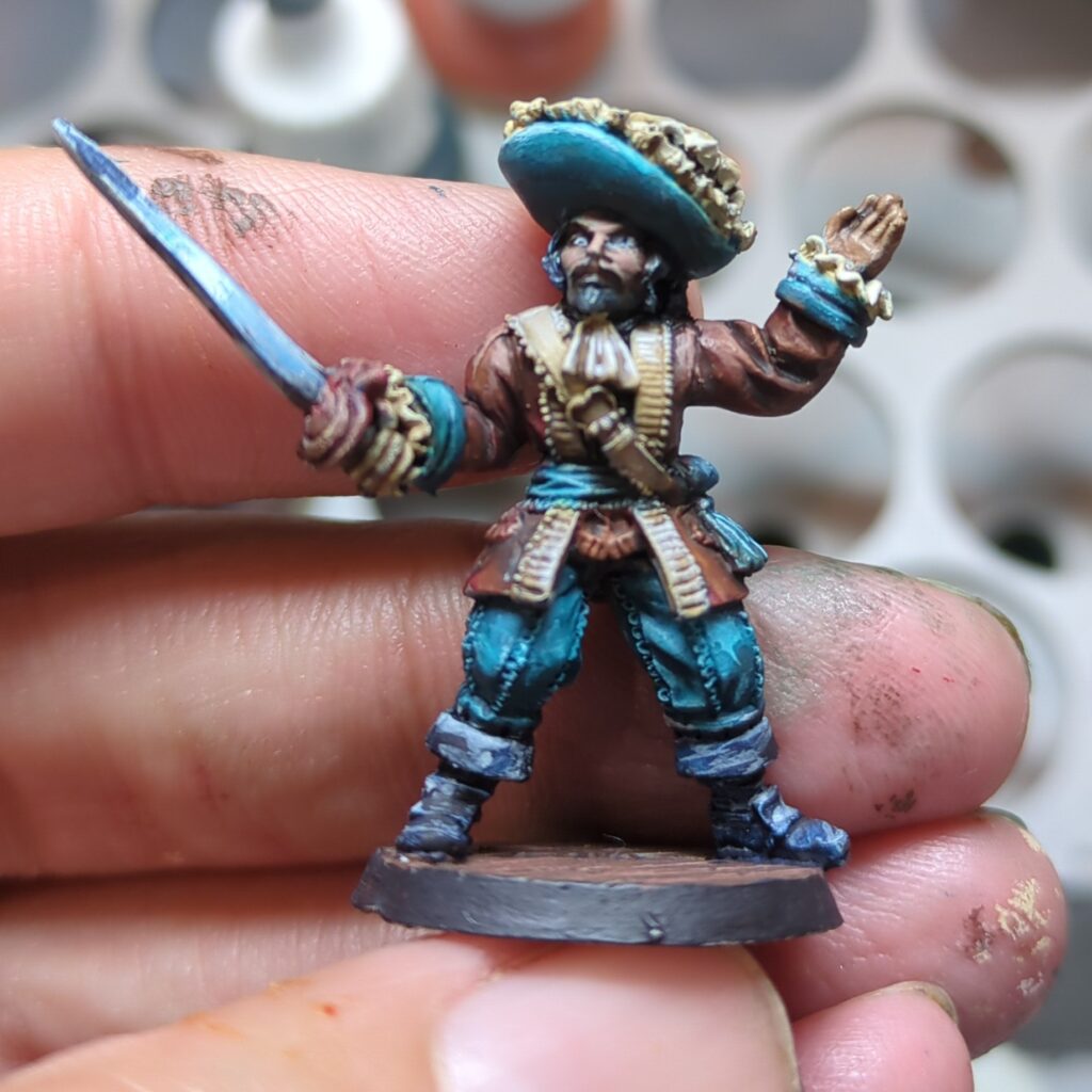
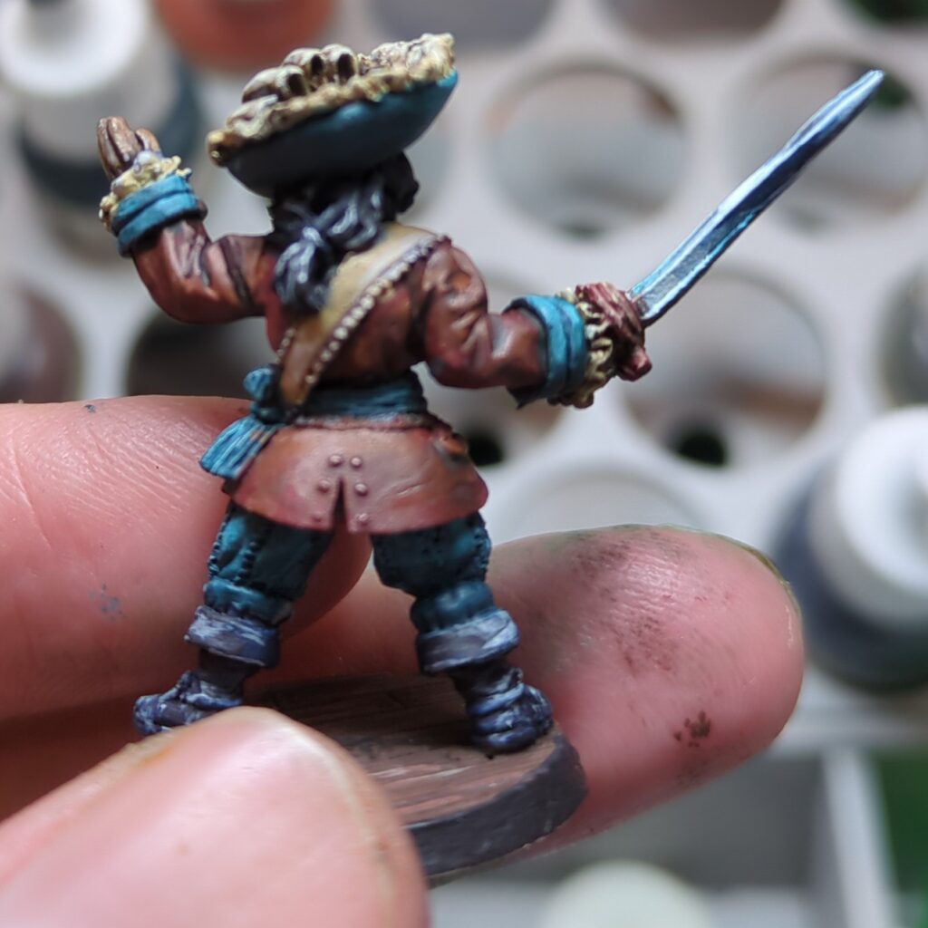
The second model I applied this too was an old Pirate mini that’s been sitting in my backlog for quite some time. From memory he was part of a set I fished out of a bargain bin long ago.
I did end up changing the colour scheme up a bit on this one, mostly because he was wearing a ruffled poets shirt that wouldn’t look right if it wasn’t white. The mahogany went well for his coat and jacket, with the teal providing a wonderful contrast for his hat, sash and pants. The darker brown didn’t end up making it into the composition.
I did put a bit more effort into pushing the contrast with this figure, which paid off and I’m very happy with the result. It definitely helps the mini pop.
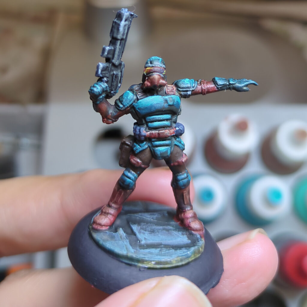
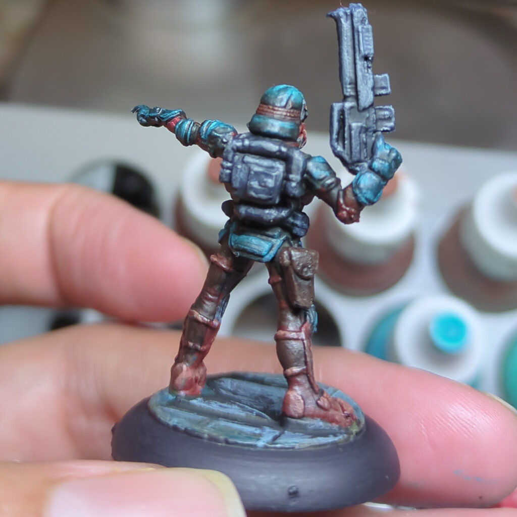
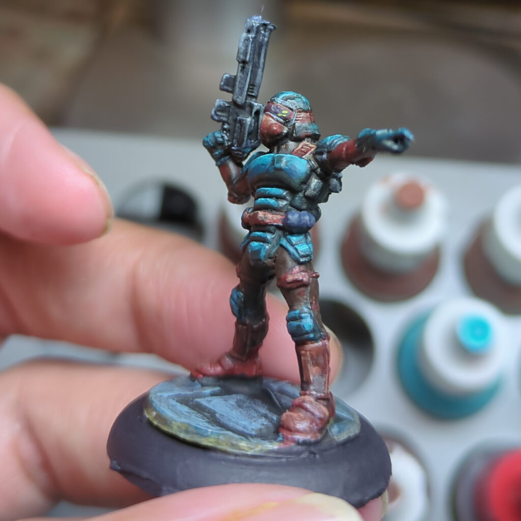
The Trooper
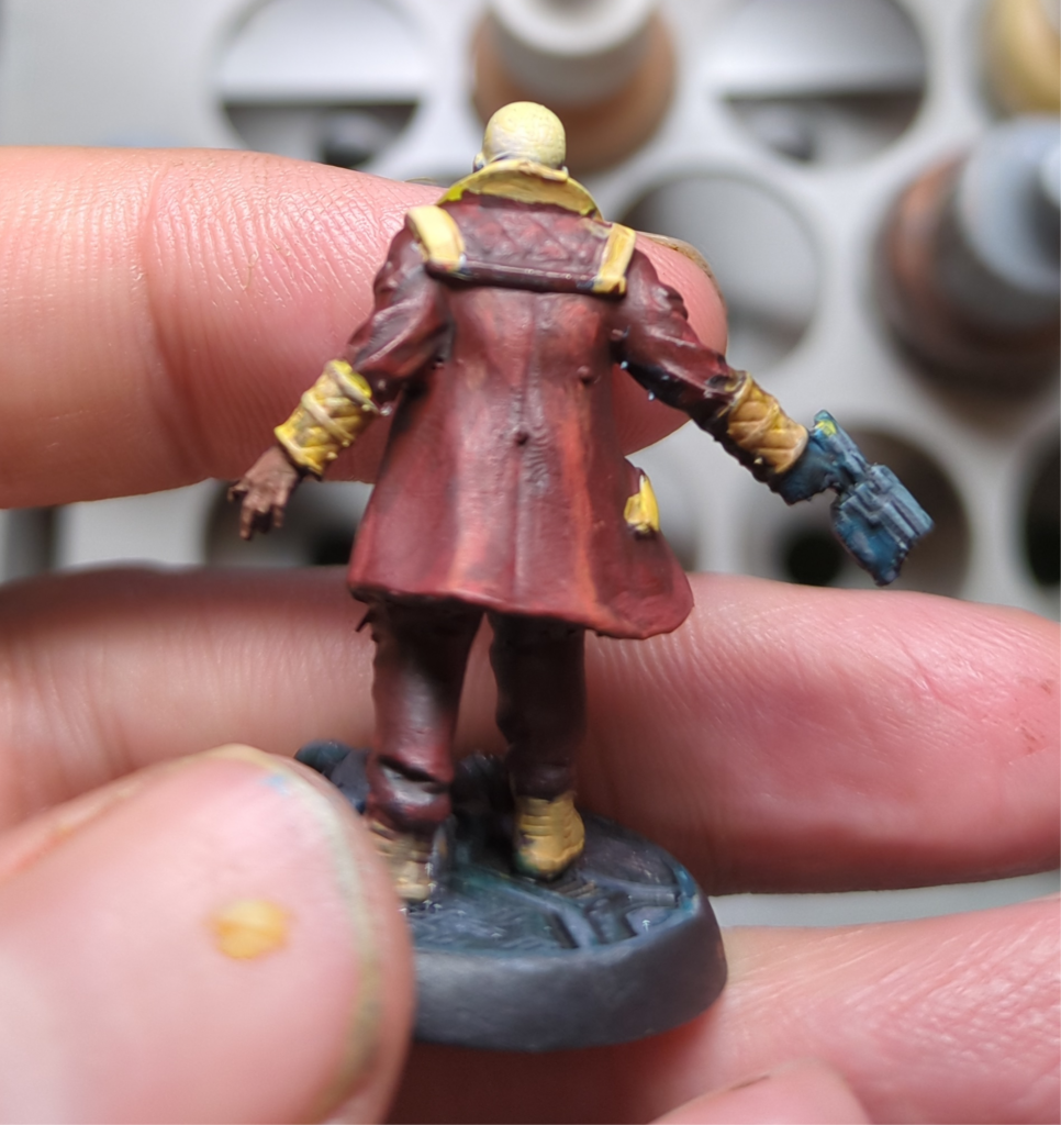
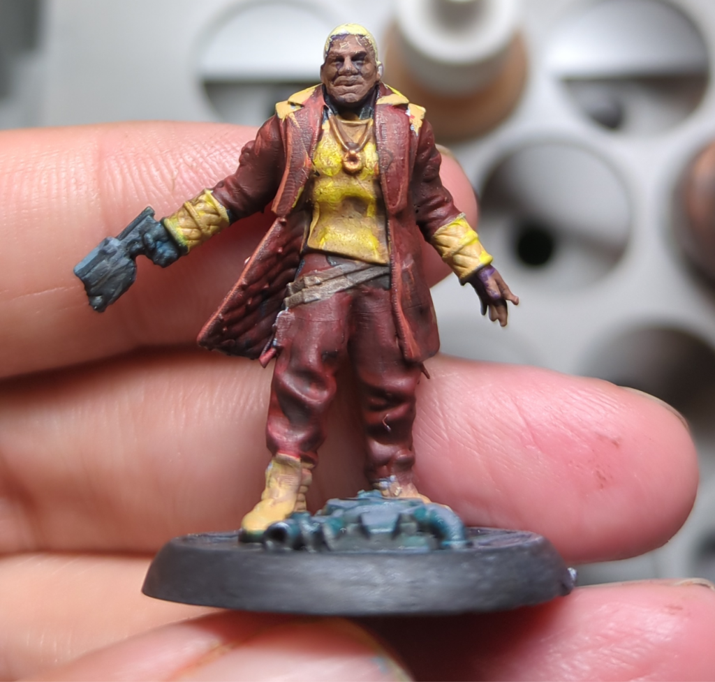
The last of the three minis was a sci-fi trooper figure from my pile of old Reaper Bones figures. I again chose to go with the more vibrant, higher contrast approach I went with for the pirate. Whilst that may not be the most realistic choice for a military uniform, it certainly produced a nice result. I do wonder if I could use this scheme for a StarGrave or Space Wierdos crew in the future.
This proved to be quite a fun experiment, and one I’ll probably repeat with other schemes in future. The teal and mahogany are both solid colour results that I’m sure to use in other schemes in the future, and I think I’ve learnt a bit of colour theory along the way.
Whilst the simplest and easiest way to paint the metal bits on your mini is just to use metallic paints, there’s a whole other effect you can go for using nonmetallic paints to simulate the highlights and reflections. I’ve been interested in giving it a try for awhile.
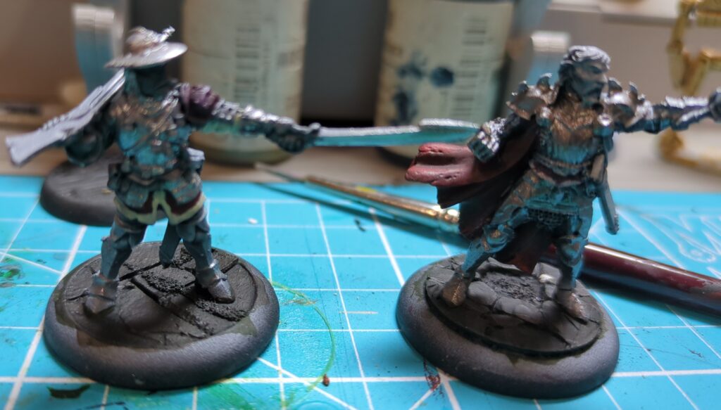
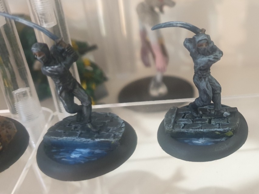
My first attempt was a couple of ninjas, painted up to look like their blades are catching the moonlight. These were good to start with as the thin katanas made it a lot easier to get a good effect.
Two 28mm Ninja figurines, each painted to look like they’re sneaking through the night with the moon glinting off of their blades.
After these, my next NMM attempt kept the same theme but had a slightly larger surface to work on. For this attempt I focussed mainly on getting the right “shapes” and ensuring there was plenty of contrast. The final result is a bit rough – it looks good at a distance but is a bit messy when inspected more closely.
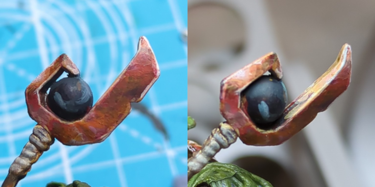
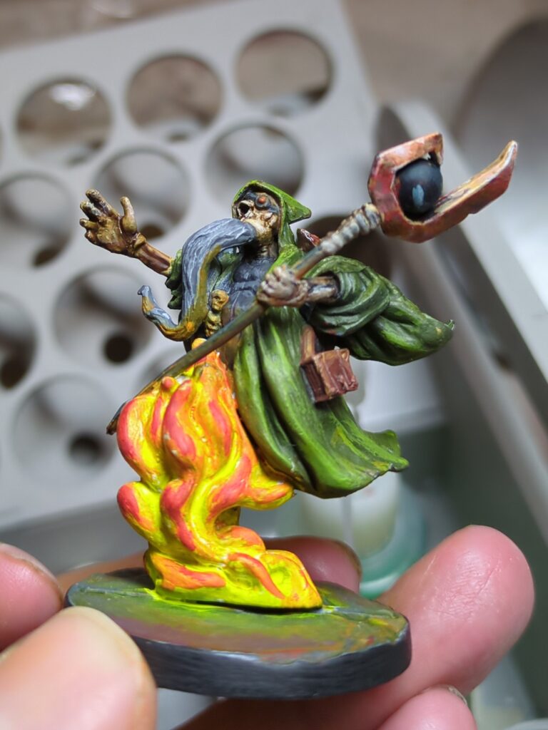
For attempt #3, I went with a more of a bronze/copper hue, painting both the weapon and the shoulder pads of a lich. My colour plan for this (based on Vince Venturella’s Copper NMM guide) involved using the following four colours:
Vallejo Game Colour Charred Brown (#72.045)
Reaper Master Series Gory Red (#09278)
Reaper Master Series New Copper (#09306)
Reaper Master Series Maggot Green (#09282)
This kind of worked out ok, but the very pinkish hue of the New Copper looked a bit wrong, so I wound up using a thin glaze of RMS Explosion Orange (#09219) to bring back more of a red and yellow hue. My first attempt looked alright, if a bit muddy, but I wasn’t completely happy with it. I then went back in and worked on bumping the contrast up a notch, which delivered a much better result.
The Halberd, first attempt on the left, with the right showing the result after bumping up the contrast
This is definitely just the start of my NMM journey, but so far there’s a few key lessons I can share.
It will look terrible right up to near the end, when it will start to look good (even then, it looks its best from a distance).
After you’ve placed your highlights expect to go back and forth repainting bits until it looks right.
The finished Lich, holding his awesome NMM halberd.